For Assignment 17, you're going to create a psychedelic poster. You are not to copy an original poster, but create a poster that mimics the style of psychedelic posters, using bands from the time period as well as a venue that existed during the 60s.
To find names of bands and venues, visit here.
Steps:
1. Choose 5 bands that you will use on your poster.
2. Choose a venue (a place that held concerts).
3. Look at examples of original posters here, and begin sketching. You must make 5 sketches. Be sure to think about your type and an appropriate visuals.
Student examples:
Friday, May 7, 2010
Sunday, April 25, 2010
How To Make Your Poster Look "Art Deco or Retro"
Many have asked how to make their poster more like the posters of the WPA time period. In order to accomplish that, you want to first look at the original posters.
What do they have in common? They were all silk screened! This is an important factor to think about, and affected the style of the posters.
Specifically:
What do they have in common? They were all silk screened! This is an important factor to think about, and affected the style of the posters.
Specifically:
- There is a limited color palette, usually only 4 colors are used-and they are not bright colors. If you are struggling with a color palette, use the colors from one of the posters, and simply use the eyedropper tool to capture the colors.
- All of the images on the poster are streamlined or simplified-think of silhouettes, almost cartoony images. (A perfect time to use your pen tool skills or the live trace option!)
- Typography-this is where many people struggle. The posters use a maximum of only 3 typefaces, mostly all CAPS and sans serif typefaces. There is some use of script type, too. These are the sites that I have found that have had some appropriate typefaces-however, some are just awful too:
- dafont - look at their Retro section as well as the Script section, especially the Handwritten and School sections.
- free typography
- font river
Wednesday, April 21, 2010
Friday, April 16, 2010
Wednesday, April 14, 2010
Tuesday, April 6, 2010
Assignment 16 - WPA FAP Poster
For assignment 16, you're going to choose a WPA FAP poster and modernize the issue, but using the colors and style of the art deco movement.
Steps:
- Complete the worksheet, reading articles on the internet (and handouts) and view the folder of original WPA FAP poster. You can download the file here, titled "originals." Also, visit this site for more information about the FAP poster division-it's pretty much the same link as printed on the worksheet, but easier for the eye to read.
- Review the folder of original WPA FAP posters and choose 3.
- Create 5 sketches total where you modernize the issues of the 3 original WPA FAP posters.
- If you need to review the powerpoint, visit here.
- Review your sketches with me, and make any corrections/re-work if necessary.
- Begin creating the poster on Photoshop or Illustrator.
Tuesday, March 23, 2010
Cool poster companies
http://www.lalalandposters.com/lalaposters.html
http://serieproject.org/artists.html
http://furturtle.com/
http://www.dkngstudios.com/work/posters/
http://weareyoungmonster.com/index.php?/projects/gig-posters/
http://www.danstiles.com/posters-trey-anastasio-phish-les-claypool.html
http://www.luredesigninc.com/
http://serieproject.org/artists.html
http://furturtle.com/
http://www.dkngstudios.com/work/posters/
http://weareyoungmonster.com/index.php?/projects/gig-posters/
http://www.danstiles.com/posters-trey-anastasio-phish-les-claypool.html
http://www.luredesigninc.com/
Thursday, March 18, 2010
Monday, March 1, 2010
Assignment 15
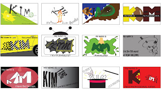
For assignment 15, you are going to create 12 different business cards that depict each persona's characteristics. You should just utilize typefaces to illustrate the idea.
· chameleon
· acrobat
· amphibian
· linebacker for the San Francisco 49ers
· taxi driver
· T.V. Evangelist
· having an allergy
· living in Port au Prince, Haiti
· having the hiccups
· being accident prone
· magician
· professional eater
Be sure to make 2 sketches of each persona. Here are a couple of examples:
Monday, February 22, 2010
Assignment 14
Wednesday, February 10, 2010
Assignment 13
For assignment 13, you're to choose a word, and replace one letter with an object. What do I mean? Check these out:
You need to make 5 sketches of 5 different words in your sketchbook.
You need to make 5 sketches of 5 different words in your sketchbook.
Monday, February 1, 2010
Assignment 12
For your next assignment, you're going to make 4 different 27th letters of the alphabet. What do I mean? In a sans serif and serif typeface, you're going to create 4 different upper and lowercase letters. Check out the examples below:
I created these letters by taking apart other letters from the alphabet, creating outlines in Illustrator, and then using the delete pen tool. One of the important things to think about is making sure that the new letters really look like they have the same look as the typeface used. After creating these 4, you're going to use both upper and lower case in a sentence.
I created these letters by taking apart other letters from the alphabet, creating outlines in Illustrator, and then using the delete pen tool. One of the important things to think about is making sure that the new letters really look like they have the same look as the typeface used. After creating these 4, you're going to use both upper and lower case in a sentence.
Wednesday, January 20, 2010
Adobe Tips - Free!
Lynda.com is one of the best places to learn techniques/get tutorials for Adobe products-however, it costs money. Adobe has their own free podcasts where you can learn about new tools in Illustrator and Photoshop. Check it out!
Assignment 11
Back in my typography class, I created all my type by hand. For assignment 11, you're going to practice this technique as well, learning more about the style and integrity of a typeface. Using Caslon, you will write your first and last name (in the traditional format, no all uppercase or all lowercase letters). If time permitting, I will show you how to make a ligature in your name. After writing your name, you will scan your name and clean it up in Photoshop-showing you some of the basic tools.
This is the format you should follow:
and this is the typeface you should use:
This is the format you should follow:
and this is the typeface you should use:
Steps:
- Create two horizontal lines 2" apart.
- From the bottom line (descender), measure 3/8" above, and make another horizontal line (baseline)
- From the top line (ascender), measure 1/2" below the line and draw another horizontal line at that mark (x-height)
- Begin writing your first and last name, do it as neatly as possible and as closely resembling the Caslon typeface.
- When you are complete, I will help you fix any additional letters
- Then, trace the name and fill in pen
- Scan the work and begin to clean it up in Photoshop.
Both your final inked name and the cleaned up version in Photoshop will be submitted for a grade!
Here are two examples prior to cleaning it up in photoshop:
Tuesday, January 19, 2010
Which Type Are You?
The geniuses at Pentagram have come up with a quiz to find out which typeface you are. Simply type in "character" as the password and discover your inner typeface. You will find the quiz here .
Wednesday, January 6, 2010
Typography Vocabulary Quiz on Friday
As stated previously, there is going to be a typography vocabulary quiz on Friday, January 8th. I have uploaded my presentation (that reviews the handout you received in class) that will help you study for the quiz.
Subscribe to:
Posts (Atom)


